


Trendlines Weekly for March 14, 2022
Edition #2

Hi everyone. Welcome to Trendlines Weekly. If you haven’t subscribed yet you can do that below.
This issue includes:
Retail and sales data show recovery from the Covid-19 pandemic
Women’s labor force participation peaked 22 years ago
The U.S. ranked second in the world in the number of political demonstrations in 2021, down from being #1 in 2020
Are Democrats about to lose non-white voters?
Inflation hits a 40-year high
Maternal mortality rises in the U.S. - again
It’s National Pi Day!
Retail sales and employment data reveal how much we’re recovering economically during the pandemic
The data on this site from the Census Bureau is three months old, but it has the advantage of offering easily available state-level results on retail sales around the country (more detailed and recent numbers are available, but that requires some digging.)
If you’re in the mood for a sobering reminder of how bad things were economically during the early stages of the pandemic, go to the site and take a look at April, 2020, when retail sales were down nearly 38% from the previous year. Economically it really was the cruelest month.
More recent data in the chart below reveal that despite a bumpy December, at the national level the retail economy has been recovering nicely since it cratered nearly two years ago.

On the employment front the latest preliminary numbers show that jobs are increasing, but that the U.S. hasn’t completely recovered to where it was before the Covid-19 pandemic. A release from the Bureau of Labor Statistics says that 678,000 jobs were added during February of this year, which was WAAAY better than the 400,000 jobs that a panel of economists predicted.
Even so, total nonfarm employment is 1.4 percent (2.1 million jobs) below what it was at its peak two years earlier, just as the pandemic was ramping up. The employment chart below looks quite a bit like the retail sales chart above, with a huge drop in the beginning of 2019 followed by a steady rise in job numbers up to the present. The numbers are good, but we’ve still got a ways to go.

One more thing. It’s clear that this recovery would have been much slower and much worse if the government hadn’t stepped in to stop the bleeding.
A new panel of economic data in honor of Women’s History Month shows that women’s labor force participation peaked 22 years ago
The U.S. formally began recognizing the contributions of women in 1982 by dedicating a week to the effort. Five years later it morphed into Women’s History Month and it’s been that way ever since. As part of this year’s commemoration the St. Louis Federal Reserve put together a dashboard of charts that concentrate on women in the formal economy. From a trendline perspective I think one of the most revealing charts is below.

The familiar part of this story is that in the years following World War II women rapidly joined the labor force and that this trend continued well into the 1980’s. The increases slowed after that and women’s employment-population ratio (basically, the proportion of women of working age in the work force) in fact peaked way back in April of 2000.
Twenty-two years ago.
The last recession during 2007-2008 took a huge toll on the ratios for everyone, and they began a slow recovery after that. But when you look at the numbers it’s clear that even before the pandemic they weren’t going to get back to the peak we saw in 2000 anytime soon.
Why is this important? Because one of the strengths of the employment-population ratio is that it measures the ability of the economy to provide jobs for the population. When it’s high that means the economy is humming along and when it’s low it indicates we’re in the doldrums.
It seems to me that this stagnation in employment-population ratios is an area of concern. The chart below shows that the U.S. is currently third in this measure, behind Canada and the United Kingdom, and trending downward. Germany is rising rapidly and if it hasn’t caught up yet, it probably will soon.

The U.S. ranked second in the world in the number of political demonstrations in 2021, down from being #1 in 2020
If you’re feeling like the past two years have been especially tumultuous on the political front in the U.S., there is new evidence to back that up. A recent report from an organization that tracks demonstrations across the globe says the number in the U.S. ranked second in the world during 2021. Only India had more. Furthermore, during 2020, when demonstrations over George Floyd’s murder and the Black Lives Matter movement were taking place, the U.S. saw more demonstrations than any country in the world.
The nature of those demonstrations also changed from 2020 to 2021. The earlier demonstrations were largely driven by the Black Lives Matter movement, while during 2021 the focus shifted to lifting coronavirus restrictions and mobilizing rightwing groups.
The number of demonstrations dropped significantly. In 2021 there were 13,121 of these events, down 41 percent from the year before. The report noted the U.S. …
… continues to be home to numerous demonstrations, despite a significant decline in demonstration events in 2021 relative to 2020. A number of drivers contributed to this sustained mobilization, often involving the same protesters assuming new purposes or agendas: shifting from the ‘Stop the Steal’ movement, which punctuated the beginning of the year with the 6 January storming of the United States Capitol building; to opposition to vaccines and other pandemic-related policies; to challenging access to abortion or critical race theory. An increasing proportion of these demonstrations also continue to be armed and take place on legislative grounds – a worrying trend given the higher risk of these demonstrations turning violent or destructive.
In addition, the Black Lives Matter demonstrations drew dramatically more attention from the government compared to the right wing/covid restriction demonstrations. While only 2 percent of all demonstrations in 2021 involved intervention by government authorities, demonstrations during 2020, largely associated with Black Lives Matter, drew government intervention 6 percent of the time. This, despite the fact that rightwing demonstrations were more than twice as likely to involve violence.
The complete report is below.
Are Democrats about to lose non-white working class voters?
This is a bit of a plug for Ruy Texeira over at The Liberal Patriot, who writes some interesting, data-driven articles on electoral politics. He often argues from a perspective that says Democrats have drifted too far to the left - I’m not sure I always agree, but I think he’s worth reading. In recent elections it’s been apparent that white working class voters have provided much of the support for Republicans, but this article shows how Democrats are losing support among non-white working class voters, especially Hispanics. Texeira argues that by not dealing with this issue Democrats are, in his words, “whistling past the graveyard.” It’s hard to disagree.
Inflation hits a 40-year high
The Consumer Price Index was released last week and it showed that prices jumped 0.8 percent in February after a 0.6 percent increase in January. Inflation rose 7.9 percent during the past 12 months. It hasn’t been this high since January, 1982.
Energy costs grew the most, at 25.6 percent during the past year, and this didn’t even include the rapid rise in gas prices seen during the past couple of weeks. Plus, even without energy and food costs being thrown in, inflation for all other items during the past 12 months stood at 6.4 percent.
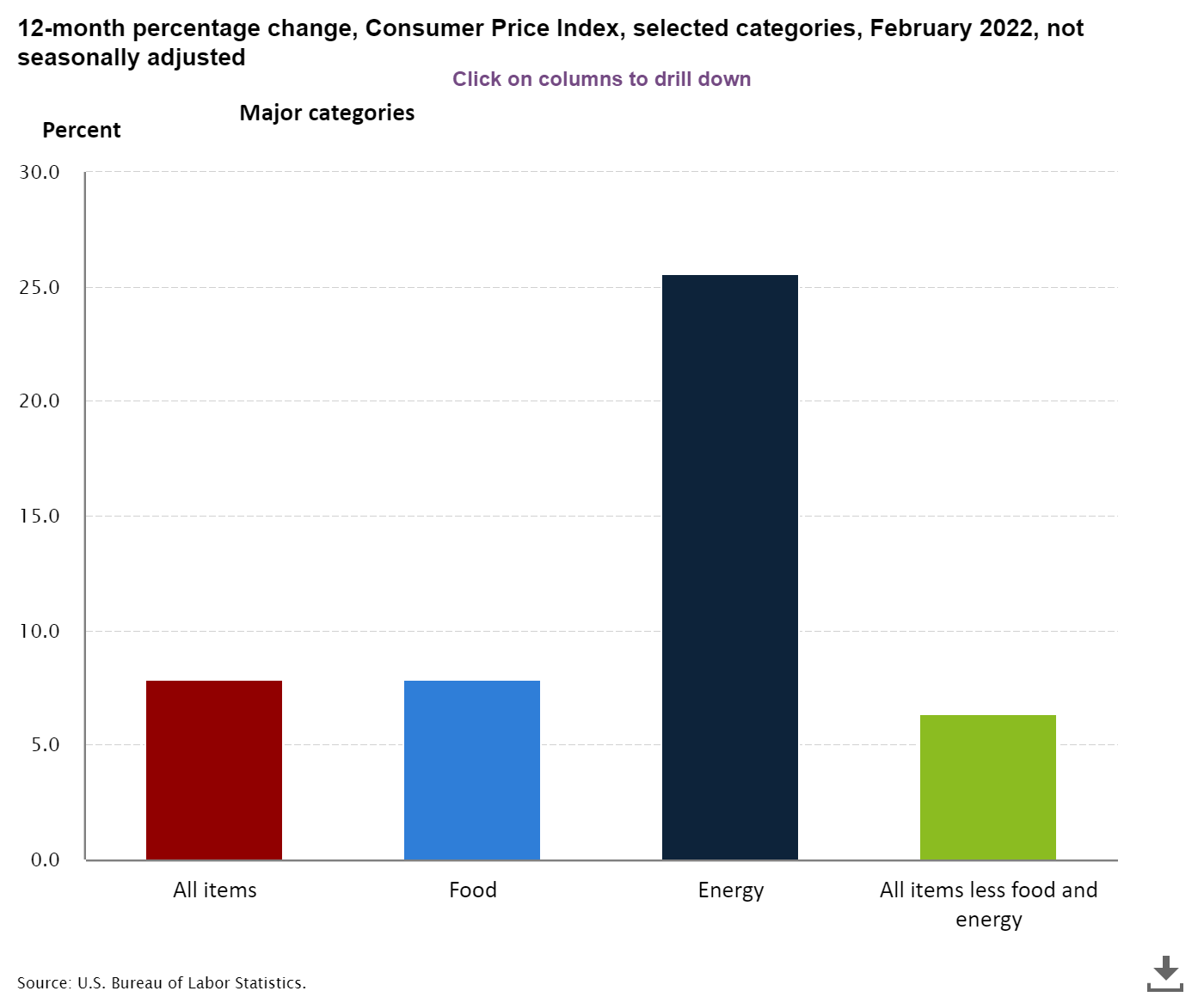
It’s hard to see this as good news and I don’t. High inflation hits poor and working class people the hardest. The only silver lining in this is that these inflation numbers are one indication that overall demand is high as the economy continues to recover from the Covid-19 recession. The chart below shows the short, sharp shock of the most recent recession being followed by the rapid rise in the CPI that we’re experiencing now.

Maternal mortality rises again in the U.S.
Maternal mortality, one of the key indicators of health and socioeconomic development around the world, is up yet again in the U.S. After declining rapidly from 1955 to 1985, the rate in this country began to climb and has trended upward ever since then. The U.S. has the highest maternal mortality rate among all developed countries, and many of these deaths are preventable.
According to the latest report on maternal deaths from the CDC, the maternal mortality rate jumped to 23.8 deaths per hundred thousand live births during 2020. The rate among non-Hispanic black women was 55.3, well more than double that number and nearly three times as high as the rate among white women.

Some investigations of the problem have noted that the U.S. employs far fewer midwives compared to other developed nations that have much lower maternal mortality rates. The Affordable Care Act requires to provide access to midwives through Medicaid, but as one study puts it, “the supply of providers is often so low that beneficiaries are often unable to access these services.”
Some have taken a broader view of the problem. An organization called Surgo Ventures put together a Maternal Vulnerability Index that was calculated for every state and county in the U.S.
Implicit in this approach is the notion that maternal mortality is a canary-in-the-coalmine indicator that exposes weaknesses in many areas, not just in maternal health care. Decreasing maternal mortality would also require things like decreasing poverty, providing better access to housing and transportation, increasing insurance coverage, improving overall physical health, reducing addiction and addressing mental health issues.
Viewing maternal mortality through this broad-based approach is certainly admirable and it probably correctly describes the scope of the problem. The question I have is, Where do we start? Leave a comment below if you have any ideas.
All you math geeks out there probably know this, but for the rest who might not be aware, today is Pi Day! Go grab a piece of pie!

Until next time, thanks for reading!
Karl Pearson

Another set of very important topics! Thanks for the briefings, Karl!
One quibble: The charts on women's labor force participation inexplicably used "age 20 (or 15) and over" to define "working age." As the number and proportion of women living well into retirement age - and their economic ability to retire at all - has increased, this measure under-estimates the rate of meaningful participation.